


How we helped
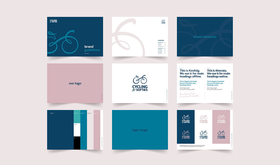
After presenting a range of creative concepts, we worked collaboratively with the client to finesse a warm and tactile new brand. Combining hand-drawn illustration with modern but informal fonts and a lovely new colour palette, the new identity lent itself perfectly to a 'Softies moment' ad campaign to launch the new look. Additional assets include an annual brochure, direct mail, social media campaigns and ongoing copywriting support.
Cycling for Softies
Cycling for Softies is a tour operator for people looking for leisurely cycling holidays across Europe. It's all about life in the slow lane, with food, drink and lovely accommodation as important to customers as the cycling itself. With a loyal customer base going back decades, this rebrand required some sensitivity to that. It needed to feel fresh and modern, yet remain soft and welcoming to those so familiar with the brand.

“We’re so pleased with the rebrand Tusk delivered for us. It’s given the brand new life, and the reaction to it from our customers has been superb. Critically, we’ve been armed with assets and guidelines that are easy to roll out both online and offline, making it a seamless process to bring everything up to date. It’s also great to have Tusk on board to deliver all brochures, DM and any other creative needed – always on time, on budget and bang on brief.”

